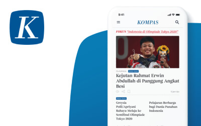

Kompas.id
App Redesign
Year 2021
Role Research, UI Design, UX Design,
Prototyping
Project Self Initiated Project
Kompas.id is a paid subscription news website/app owned by Kompas Gramedia. On Kompas.id, subscribers can access news that published in Kompas Daily newspaper, updated news and additional contents (research, visual/interactive speech, behind the news, etc).
Kompas.id can be accessed through the website & app (Android & iOS). Kompas.id app has the same design both on Android & iOS.
Live Prototype → New Kompas.id App
App Review
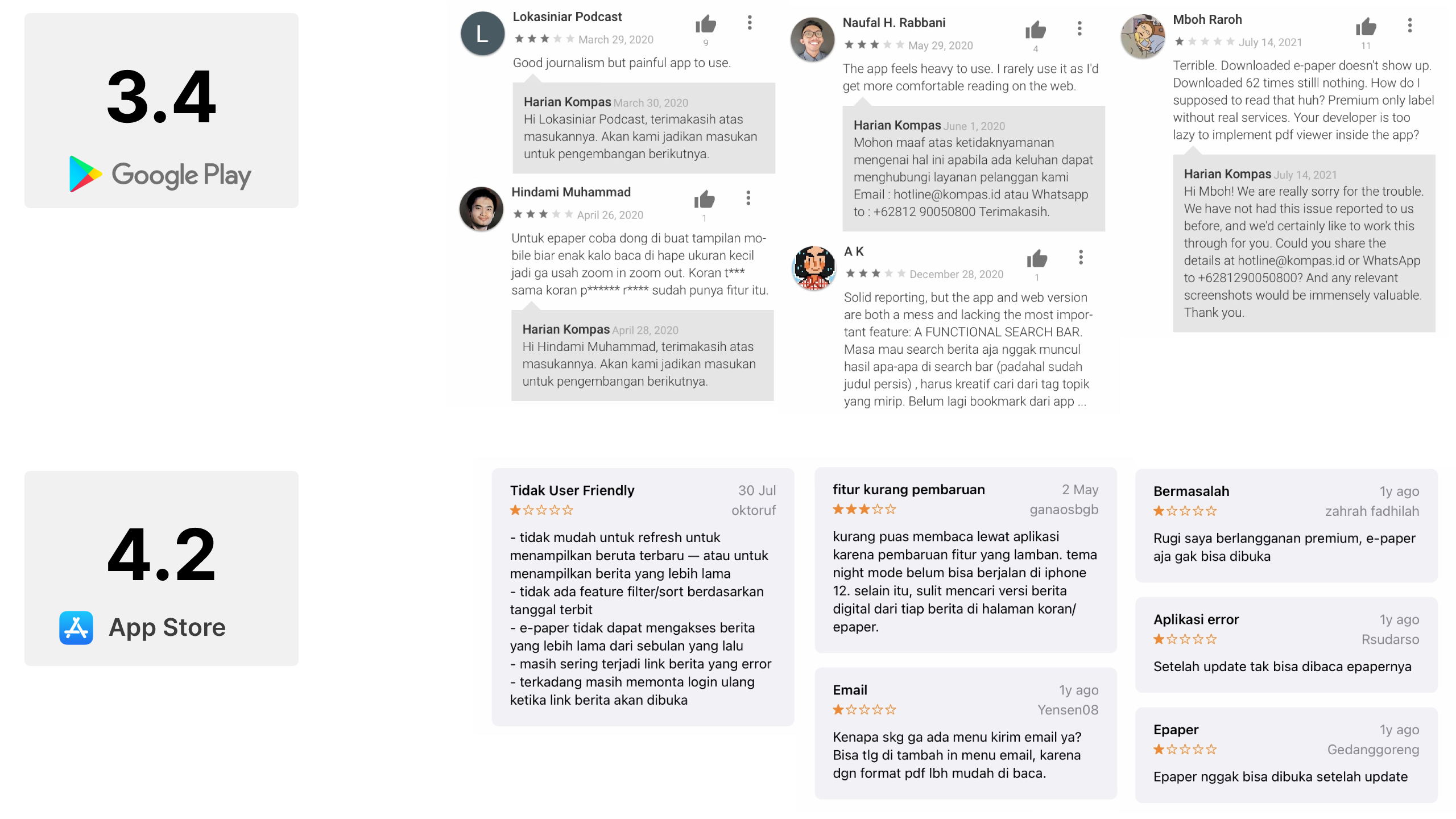
Problems
"Users are not comfortable using the current Kompas.id app"
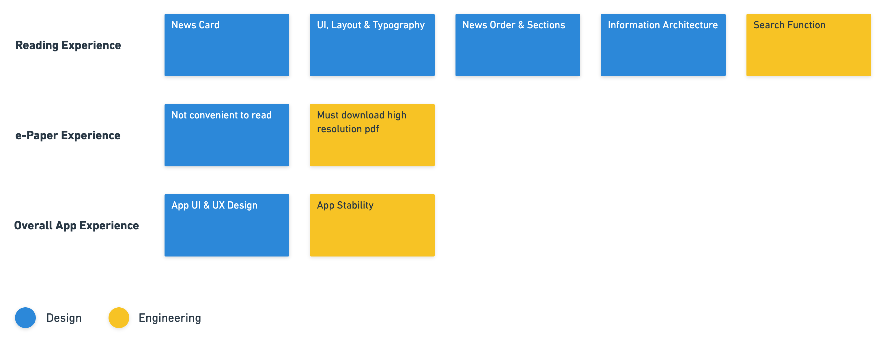
Proposed Solutions
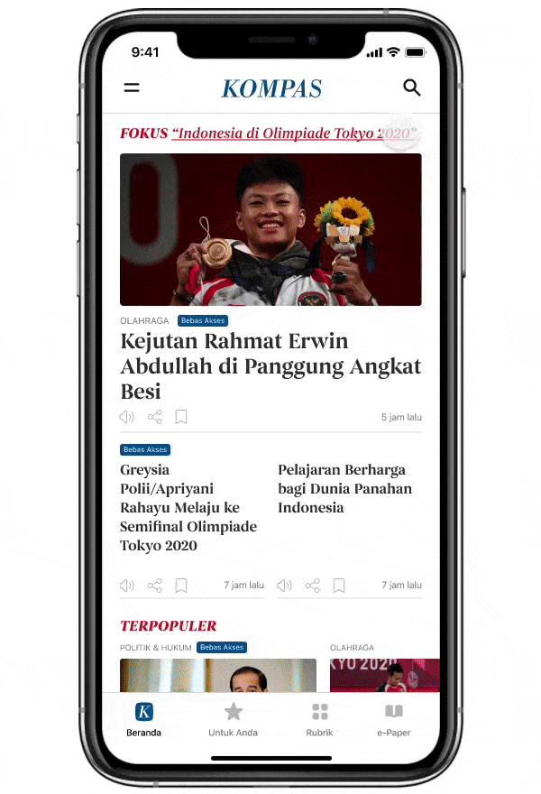
1. News Card

Before
Every news card takes up quite a lot of space, so to browse news titles user has to scroll a lot.

After
Make news card more compact so users can explore more news titles in one scroll.
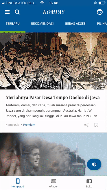
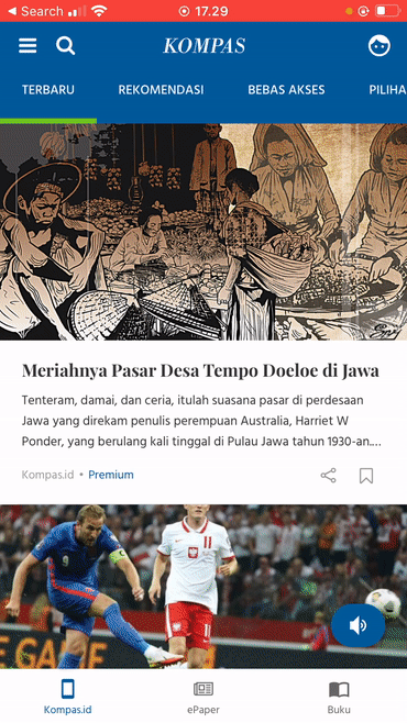
2. News Order & Sections
Before
Too many News Sections displayed in one row, including:
- "Latest News"
- "Recommended News"
- "Free Access News"
- "My Picks"
- "Most Popular News"
- "Printed News"
After
Redesign the News Sections from tabs on a single row to integrated content on related pages:
- "Latest News": all news on Kompas.id is displayed in chronological order, except for the "Most Popular News" & "Focus News" (editorial recommendation)
- "My Picks": created a separate page (new menu) called "For You" to display news according to the preferences of the topics that selected by the user
- "Free Access News": user can access "Free Access News" by clicking the "Free Access" tag or go to "Topic" menu and choose "Free Access" category
- "Editorial Recommendation": at the top of the "Home" page there are editorial recommendation news section called "Focus". In this section the editor can display their selected news, for example: a news collection of "Tokyo Olympics 2020"
- "Most Popular": 5 most popular news will be displayed in the "Most Popular" section (carousel)
- "Printed News": The printed Kompas Daily contents can be accessed in the "ePaper" menu which can be read in Mobile View Mode and Classic PDF Mode
3. Information Architecture
Before
The information architecture & features placement on the app are not efficient.
After
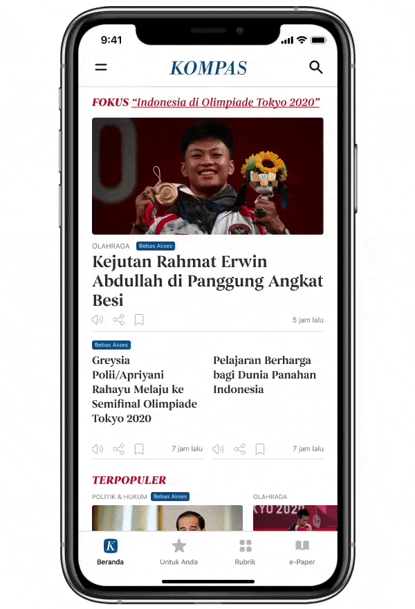
Improving Kompas.id app information architecture & reorganize features placement to make it more efficient. I changed main menus/features:
"Kompas.id", "ePaper" & "Books" → "Home", "For You", Topics" & "ePaper" (English)
"Kompas.id", "ePaper" & "Buku" → "Beranda", "Untuk Anda", Rubrik" & "ePaper" (Bahasa Indonesia)
4. ePaper
Problem
"ePaper" (Kompas Daily newspaper reader) still uses Classic PDF format so not convenient for user when reading it from a smartphone because user has to zoom in & zoom out the PDF to browse & read articles.
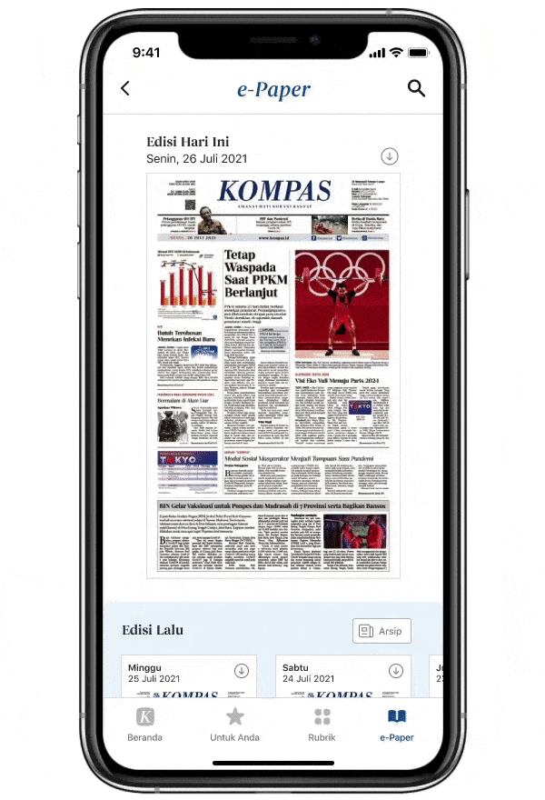
Solution
Redesign "ePaper" to become more mobile friendly. Each title/photo/article on the ePaper can be clicked & then will bring user to mobile page version of the article. So users can easier to read the articles.
5. Search
Before
"Search" feature is not efficient because every time you want to do a search you have to choose one of the results tabs ("Kompas.id", "Books" or "ePaper" tabs).

After
Rearranged the "Search" feature placement & changed a bit the algorithm scenario. The "Search" feature on the "Home" & "Topics" pages will display search results across all Kompas.id contents (ePaper, updated news & additional contents). While the "Search" feature on "ePaper" page will only display search results of ePaper contents.
6. Books
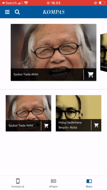
Before
"Books" (e-book readers) are not well integrated & a bit confusing for user because user only can buys/adds new digital books through Kompas.id e-commerce website but there is no such feature in Kompas.id app.
After
I was confused when first time accessing the "Books" page menu (e-book reader). There are 2 pre-downloaded books on the app but I can't find any menu to add/buy another books to the collection. I asked a friend who had worked at Kompas.id, according him to add a book to the collection user must purchase it through Kompas.id e-commerce website (Gerai Kompas.id). This flow is quite weird because user can read digital books on Kompas.id app but they can't purchase a book through the app.
Currently, the Kompas.id e-commerce website (Gerai Kompas.id) not only provides digital books but also printed Kompas Daily newspapers subscription, printed magazines, printed books, souvenirs (board games, t-shirts, post cards), tickets & Kompas.id subscription. So to make product development more focused and does not confuse users, it's better for Kompas to make separate apps between Kompas.id app and Gerai Kompas.id & Books app. On my current design I removed the "Books" feature (e-book reader) from the Kompas.id app.
7. UI, Layout & Typography
Before
The UI design is a bit outdated dan the layout is not efficient. The typography is good enough but can still be improved.
After
Redesign the UI, layout & typography to make user easier to browse & read news.