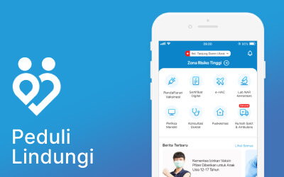


PeduliLindungi
App Redesign
Year 2021
Role Research, User Flow, Wireframing,
UI & UX Design, Prototyping
Usability Testing
Project Bootcamp Challenge
PeduliLindungi is an application developed by Indonesia Ministry of Communication and Information Technology (Kominfo) supported by Indonesia Ministry of Health (Kemenkes) to assist relevant government agencies in tracking to stop the spread of Coronavirus Disease (COVID-19).
The current PeduliLindungi app has features:
- Scan to enter building
- Case statistics
- Register for vaccination
- Vaccination certificate
- COVID-19 test results from labs registered on the Ministry of Health (New-All Record System/NAR)
- Hospitals, health centers, pharmacies list
- e-HAC (Indonesia Health Alert Card)
- Teledoctor
Live Prototype → New PeduliLindungi App
Official Pandemic Related Apps & Website in Indonesia
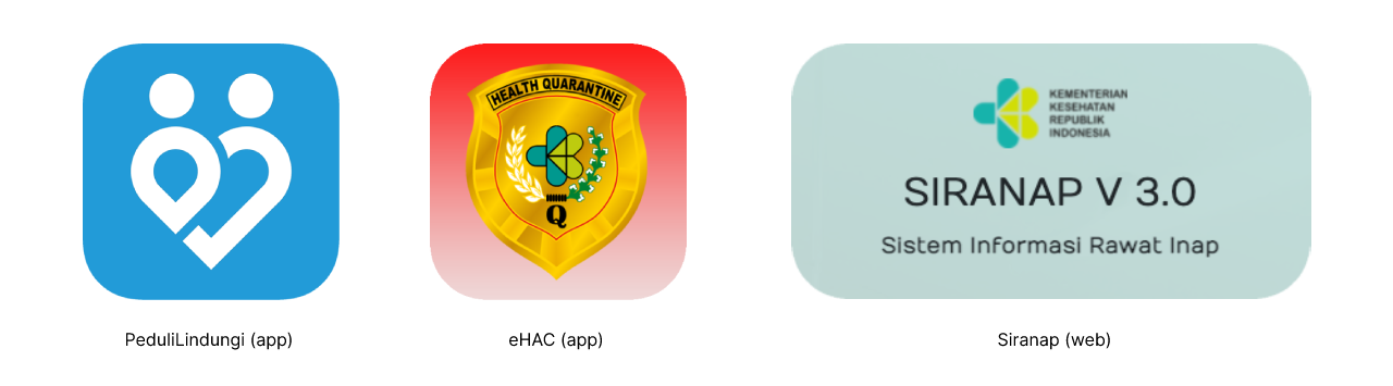
In the last 1.5 years there have been 3 important applications & website related to the COVID-19 pandemic launched by the Indonesian government:
- PeduliLindungi by Ministry of Communication and Information Technology (Kominfo)
- e-HAC (Indonesia Health Alert Card) by Ministry of Health (Kemenkes)
- Siranap (Inpatient Information System) by Ministry of Health (Kemenkes)
Recently e-HAC has been merged with PeduliLindungi, while Siranap has not.
Problems
From the mini research that I did through interview and observing Indonesian netizens’ tweets, I got the insight that public need an official COVID-19 all-in-one app from the government. Not only for tracing, registering vaccinations and vaccination certificates but also for emergency situations such as ambulance contact & information on hospital availability. Of all the official applications available, the PeduliLindungi application is the most suitable to meet those needs.
Based on the tweets of Indonesian netizens on social media, netizens feel that the PeduliLindungi app still needs to be improved to make it more comfortable to use, especially regarding UI & UX design.
So the focus of this case study is:
- Integrating Siranap into PeduliLindungi app
- Improved the UI/UX of PeduliLindungi app
Users & Audience
Tech savvy people in Indonesia who are facing the COVID-19 pandemic
Scope & Constraints
- Platform: Mobile (iOS)
- Time: 2 weeks
- Team: Zusuf (one person only)
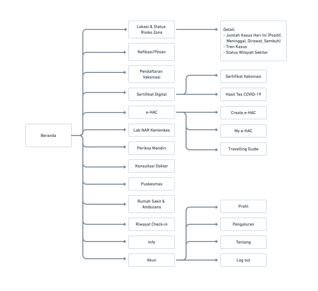
Information Architecture
I did some changes on PeduliLindungi information architecture:
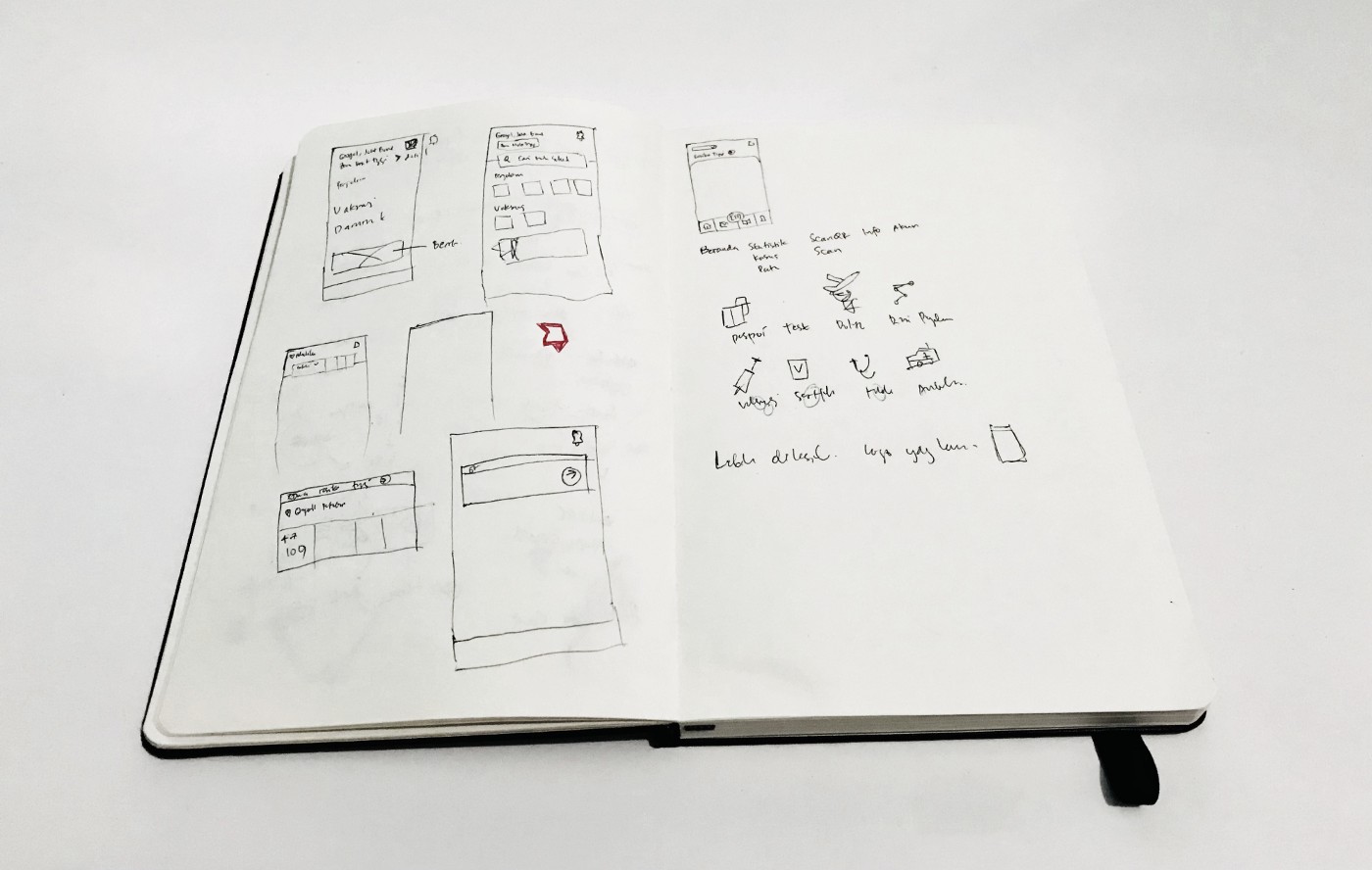
Sketch
After I finished the research, I did some sketchs to look various alternative design solutions.
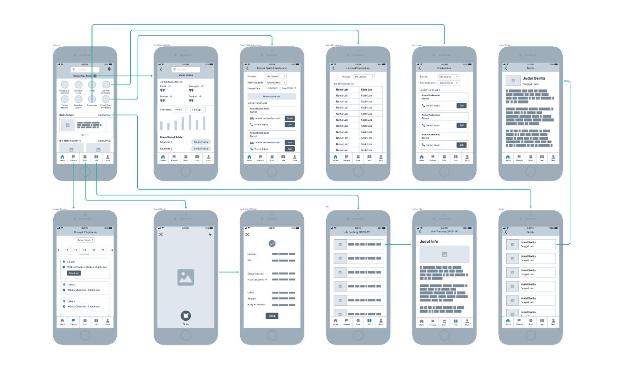
Wire Frame & Wire Flow
UI Design (Before-After)
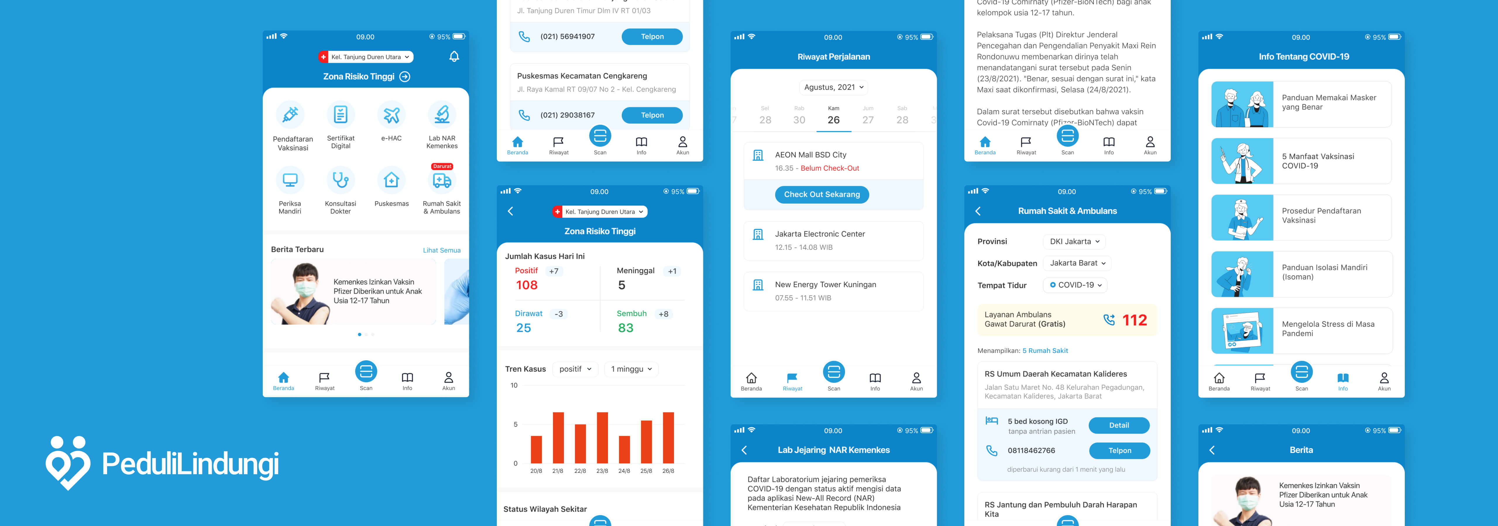
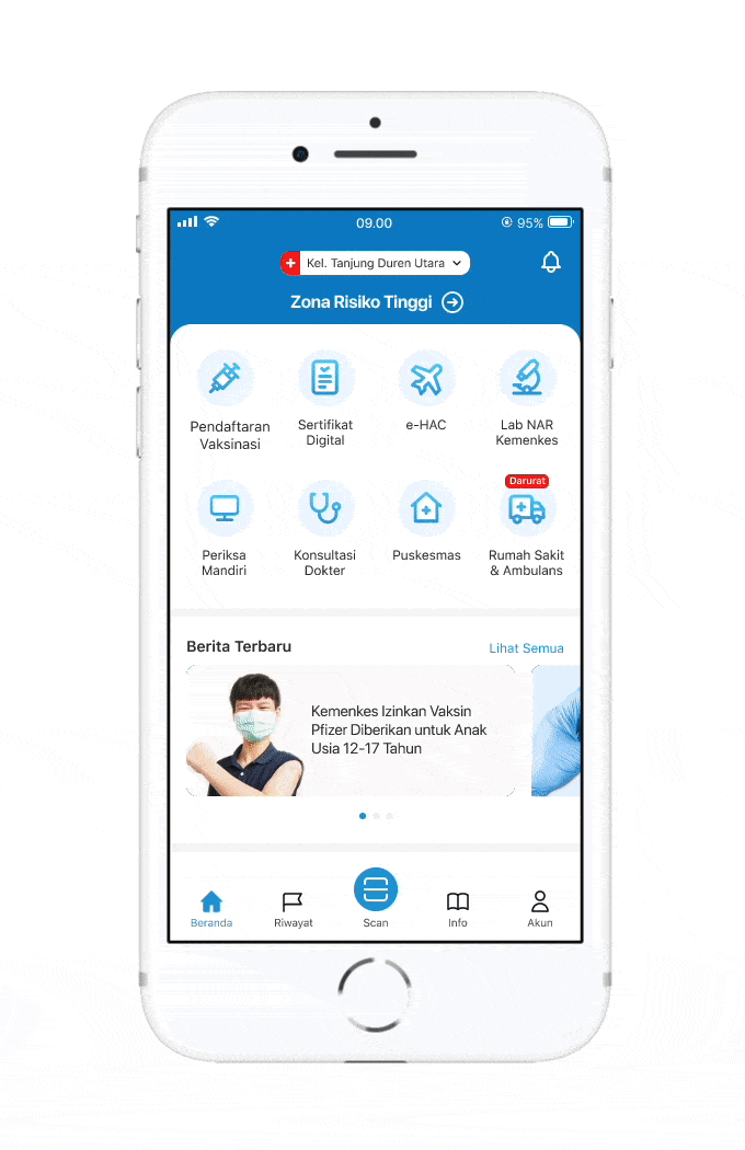
Home
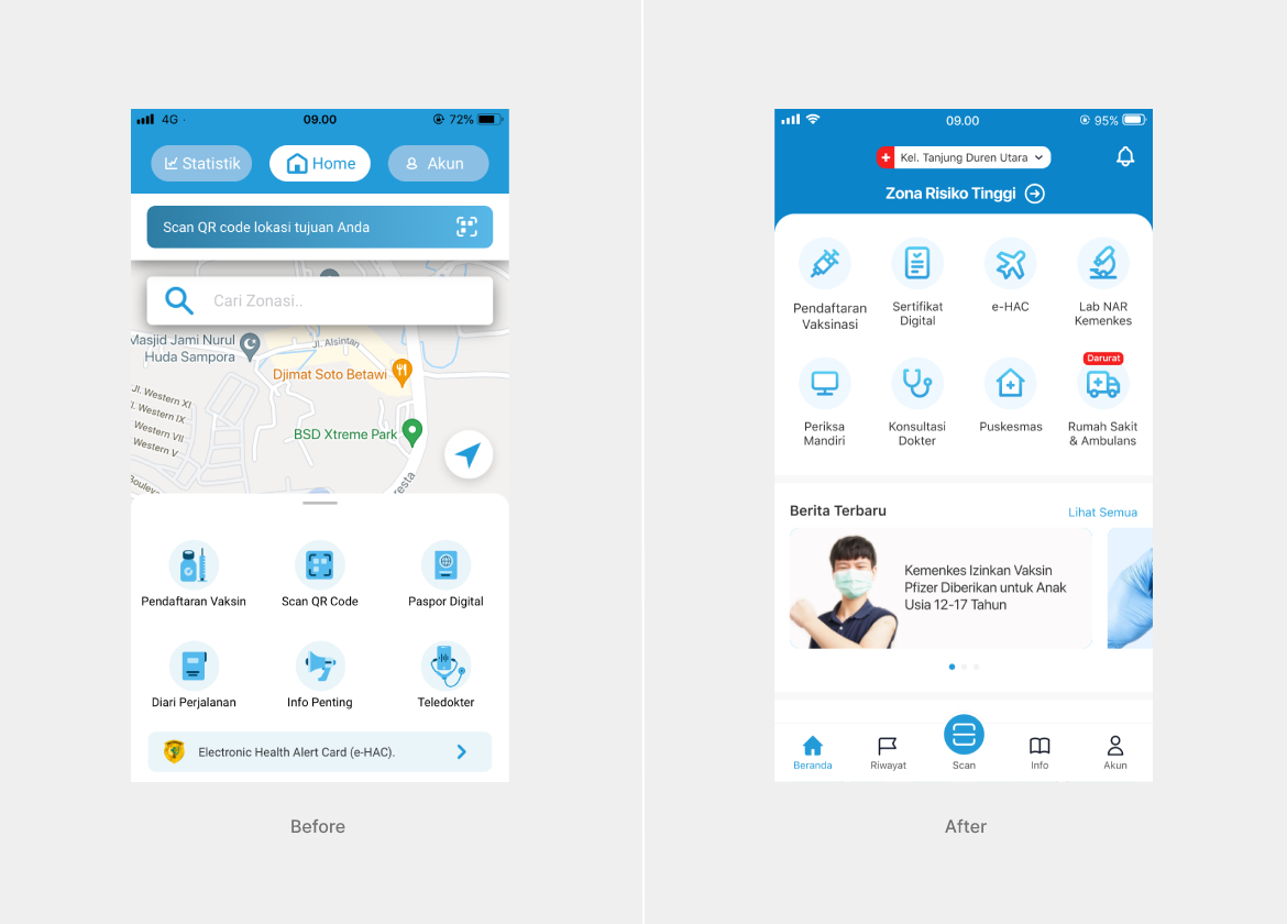
➊ The "Maps" feature is removed from "Home" because this feature makes loading the "Home" page quite heavy both in terms of RAM usage and internet data and not all users need the map every time they open PeduliLindungi app.
➋ “Location” & “Zone Risk Status” move to the top. If you click on “Region Risk Status”, you will go to the case statistics page for that region.
➌ The “Scan QR Code” button has been changed from 2 buttons (above & below the page) to only 1 in the tab bar so not redundant. In addition, the icon size is made the largest with a striking color among other tab bar menus to make it more discoverable and accessible to users. Because "Scan QR Code" is a feature that is most often used by daily users to check-in entering buildings, malls, offices, etc.
➍ The “Hospitals & Puskesmas” menu was moved to the top combined with other main features. Because in the current PeduliLindung app when opened on an 'old' model smartphone (9:16 screen ratio) the "Hospital & Puskesmas" menu does not appear on the first glance (users must scroll down first). For this reason, in this design exploration I deliberately used a 16:9 ratio screen size to accommodate the accessibility of the PeduliLindungi app on the 'old' model smartphone.
➎ The "e-HAC" menu has also been moved & combined with other main features so all main features are in one place and user easier to access.
➏ Removed the “COVID-19 Talks (Instagram)" section & replaced it with the “News related to COVID-19” section.
➐ Moved the “Tips” page to the tab bar & renamed it “Info”. In current PeduliLindungi app, there is actually a "Tips"/"Info" page, but it is placed on the "Account page". I think this placement is quite strange because this section is rarely accessed by users. Even though the "Info" page can be maximized for educating users about health tips related to the COVID-19 pandemic, from the topic of prevention, self-isolation, action during emergency conditions, recovery to vaccination.
➑ The tab bar menu is moved from top to bottom to make it easier for users to access using one hand (close to the thumb). Apart from that, the menu arrangement has changed from “Statistics”, “Home” & “Account” to “Home”, “History”, “Scan”, “Info” & “Account”.
➒ Redesign the main feature icons.
Zone Risk Status/Statistic
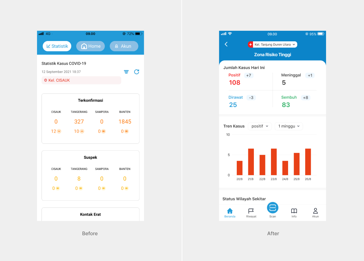
The “Zone Risk Status” page is a replacement for the “Statistics” page. For daily case updates, statistics are displayed in numbers format. Meanwhile, the case trend is displayed on bar chart format to make it easier for users to read the trend whether the case is rising or falling within a certain period of time (daily, weekly & monthly).
Hospitals and Ambulance
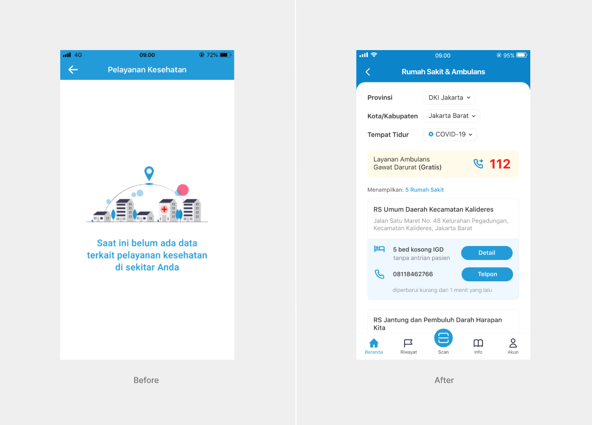
The “Hospital & Ambulance” page is an integration of the Siranap to PeduliLindungi.
The contents of the “Hospital & Ambulance” page are the same as the Siranap application including the list of:
➊ Hospital Name
➋ Hospital Address
➌ Hospital Phone Number
➍ Number of available beds for COVID-19 & Non COVID-19 patients
➎ Number of ER queues
➏ Description of the time the data was last updated
In addition, I added ambulance/emergency contact for each region.
Puskesmas/Public Health Center
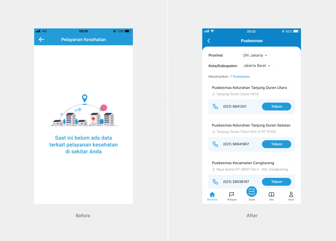
Made separated “Puskesmas" page that includes Puskesmas address & phone number.
NAR Labs (New Feature)
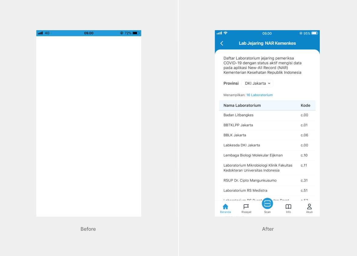
Added "NAR Labs" page to help user find COVID-19 test labs that registered in Ministry of Health NAR (New-All Record) system. The labs that registered in NAR system will automatically update their COVID-19 test results into PeduliLindungi app.
Usability Testing
- Methods : Moderated usability testing using Zoom & Maze and Unmoderated usability testing using Maze
- Number of testers : 6 testers
- Number of tasks : 7 tasks
- Note : All testers have used the PeduliLindung app before
Learnings from User Feedback
- In Task 1 “Check Zone Risk Status Details”, only 1 out of 6 testers (17%) completed the task. It is possible that this is due to the fact that the task is given in the first order where the tester is still in the phase of studying the new UI of the PeduliLindungi app and "Risk Zone Status" is a 'new' feature. To prevent the problem we can add tooltips when introducing a new feature (redesign feature) in the app.
- In Task 2 “Change Location”, 4 out of 6 testers (66%) completed their task. The possible reason is that some testers are still not familiar with the UI design or maybe the "Location" button needs to be enlarged. Solution to this problem is add tooltips when introducing new feature in the app.
- In Task 3, 4, 5, 6 & 7 all testers had no difficulty finishing the tasks. They finished all tasks smoothly (96% completed the task).
- 5 out 6 testers (83%) preferred the new PeduliLindungi app design. While 1 tester is still confused when operating the new design. She said that's because the icon looks different from the previous design.
- 2 testers scored 9.0 for the new PeduliLindungi application design and 4 testers scored 8.0. So on average, testers gave score 8.3 for the new design. In general, testers prefer the new PeduliLindung application design over the previous one.
Key Learnings
- When further investigated, the results of unmoderated usability testing results are not as good as moderated usability testing results. One of the reasons is that I did not provide a prototype for the tester to try before doing usability testing. So that in Task 1 the testers need a long time to learn the UI first and then complete the given task.
- But on the other hand, there is a positive thing, namely if the results of unmoderated usability testing are good, it means that the new design is easy to use because users can learn the application quickly.